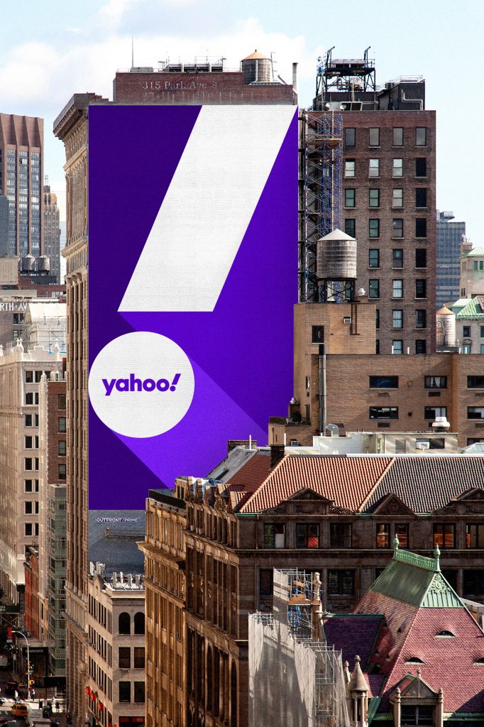
A Yahoo rebrand? You could be forgiven in thinking that Yahoo is no longer around. In what now seems like a distant past, the internet icon dominated in search, email and news and was the default destination for many of us in the early naughties. However, since then, it has struggled significantly as Google (and others) began to expand their portfolio of products, which in turn left Yahoo looking somewhat irrelevant.
Not since since 2010 has Yahoo tried to use a rebrand to kick start their company. It didn’t work then and it’ll be interesting to see if a makeover has the desired effect this time, assuming they’ll be focusing this time on their service offerings as the main reason people will choose them as a desirable destination, other than a shiny new coat.

For the Yahoo rebrand, they chose the well-respected Design agency Pentagram, who have a track record of innovative campaigns for the likes of Citibank and United Airlines.


The design looked to adopt a familiar look, tipping it’s hat to Yahoo’s signature purple colour which it adopted in 2003 but tweaked the palette to give it a more contemporary feel. The Yahoo rebrand what they call grape jelly with secondary purples known as hulk pants and malbec as accent colours. And who doesn’t love a bit of humorous colour names?

The new brand identity coincides with the launch of other new products including a reimagined Yahoo Mail app.
Here are short showreels highlighting the brand in movement…
The ‘y’ and !’ of the logo are set at an angle of 22.5 degrees, the foundation for a visual language designed around angles and slices. That angle is set at precisely 1/16th of a circle, with Pentagram explaining it as “a forward tilt that suggests a sense of momentum and excitement”.
To learn more about it from the horses mouth, so to speak, you can read further about the project in Pentagram’s Yahoo Rebrand article.
Get in touch, if you’d like to discuss how Eastworks can help you with Branding >>

